


 LinkedIn

 Mailchimp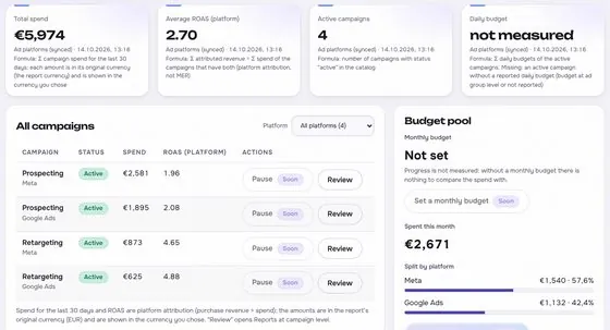


 GA4
GA4


 Instagram

 Mailchimp
Definition
A client dashboard is a shared page that shows the agreed numbers for an agreed period, with each figure's source, definition and last refresh time. It is the view the client uses to check the work without asking for a new report every week.
How to use it
A dashboard is useful only when every number on it can be traced. Each figure needs a label, a source, the formula or definition behind it and the time it was last updated. A number without those is an opinion, and a client who finds one unsupported figure may stop trusting the rest. Keep the list short, so that the page answers the questions the client actually asks.
Agree the list of metrics and their definitions at the start, and write them into a shared glossary the client can read. Show platform figures and store figures apart, and label any metric that was not measured as not measured, rather than showing a blank or a zero. Review the page each quarter and remove the figures that nobody uses.
One screen the client can trust
A client dashboard shows the few numbers a client needs to judge the work: spend, orders, revenue, cost to acquire a customer and return on spend. It should answer the question, are we on track, in a minute. Show data gaps in a visible notes block.
Keep the definitions of all metrics in a glossary the client can open. Fewer numbers, clearly labelled, beat a wall of charts. Each number should say where it came from, how it is calculated and when it was last updated. Remove tiles that nobody has used for a quarter.
Showing gaps and sources honestly
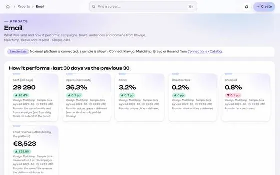
When a figure is missing, show not measured, not zero. A false zero looks like a failure and starts the wrong conversation.
Explain differences between sources. If platform conversions exceed store orders, say why that happens and which number is used for decisions.
Keeping it useful over time
Ask the client which decisions the dashboard should support, and drop numbers nobody uses. Review it every quarter.
Use the dashboard as the base of regular meetings. It keeps talks about facts, and it lets the client check progress without asking for a report.
Choosing and ordering the numbers
Start with the question the owner asks most: is the money working? Put spend, orders, revenue and cost per new customer at the top. Put detail lower on the page or on a second view, so the first screen stays calm. Order the numbers by decision, not by platform.
With made-up numbers, a top row of spend, orders and return, a middle row of new versus returning customers, and a bottom row of data gaps and notes tells a complete story. Each tile shows its source, its formula and its last update time.
Dashboards and trust
Trust grows when numbers hold up under questions. If a client asks where a figure comes from, the dashboard should answer without a call. Source, formula and update time on each tile make that possible.
Trust also depends on admitting limits. Show tiles that are not measured as such, and put a short note on why. A page that shows its gaps looks more reliable than one that appears perfect and then fails a spot check.
Common mistakes
- Filling the page with charts nobody reads.
- Showing zero where data is missing.
- Mixing sources without labels.
- Never asking the client what they use.